Responsive Ready
Awesome Design
Easy to Install
Well Documentation
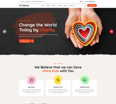
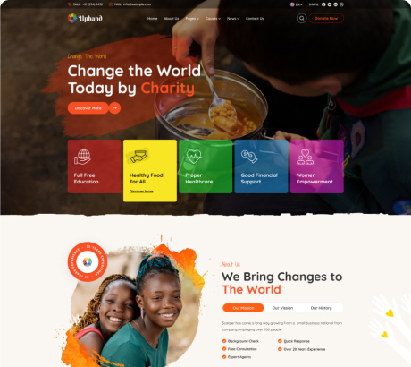
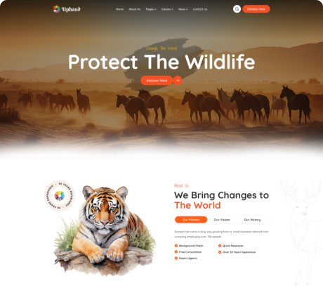
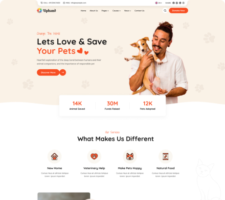
5+ Home Pages

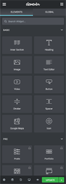
Front-end Real-time Editing
with Elementor
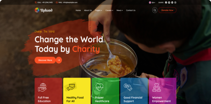


Lots of Header Style
We offer a diverse range of five distinct header styles, each meticulously crafted to suit various preferences and design needs. Our header styles are thoughtfully designed to enhance the visual appeal and functionality of your website or application.
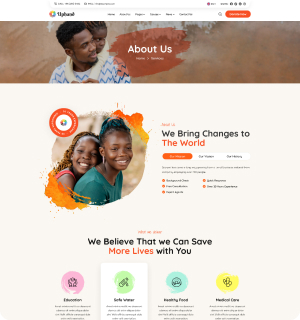
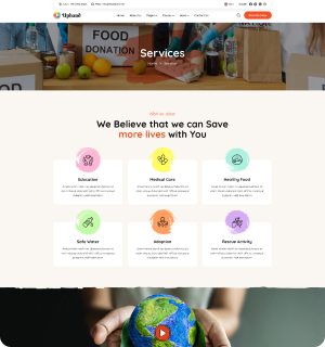
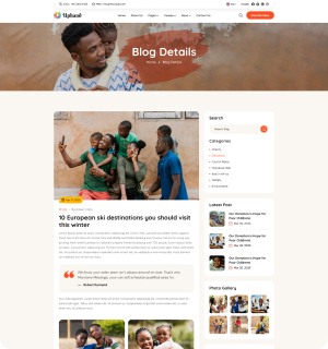
Unique Sections
Creating unique website sections can greatly enhance user experience and engagement by providing value, entertainment, and useful information. An eyewear store could allow users to upload their photo and see how different frames look on their face. A section that provides real-time support to users through chatbots or live agents.

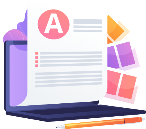
Well Documentation
Well-documented web templates are an essential asset for developers, designers, and users alike, providing comprehensive guidance and instructions for effectively utilizing and customizing the template to meet specific project requirements.
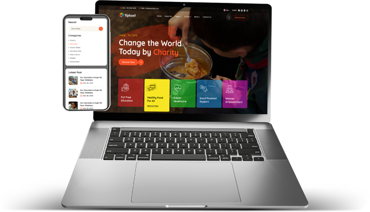
Responsive designs
A fully responsive design is a web design approach that ensures a website's layout and content adapt fluidly to fit various screen sizes and devices, providing an optimal viewing experience for users across desktops, laptops, tablets, and smartphones.
This adaptability is achieved through the use of flexible grids, images, and CSS media queries, allowing the website to dynamically adjust its appearance based on the dimensions and capabilities of the user's device.
Compatible with Powerful
Exclusive Plugins

Mailchimp Email

Elementor Builder

WooCommerce Integration

Contact
Form 7
BuddyPress Addons

Yoast SEO Plugin

One Click Installation